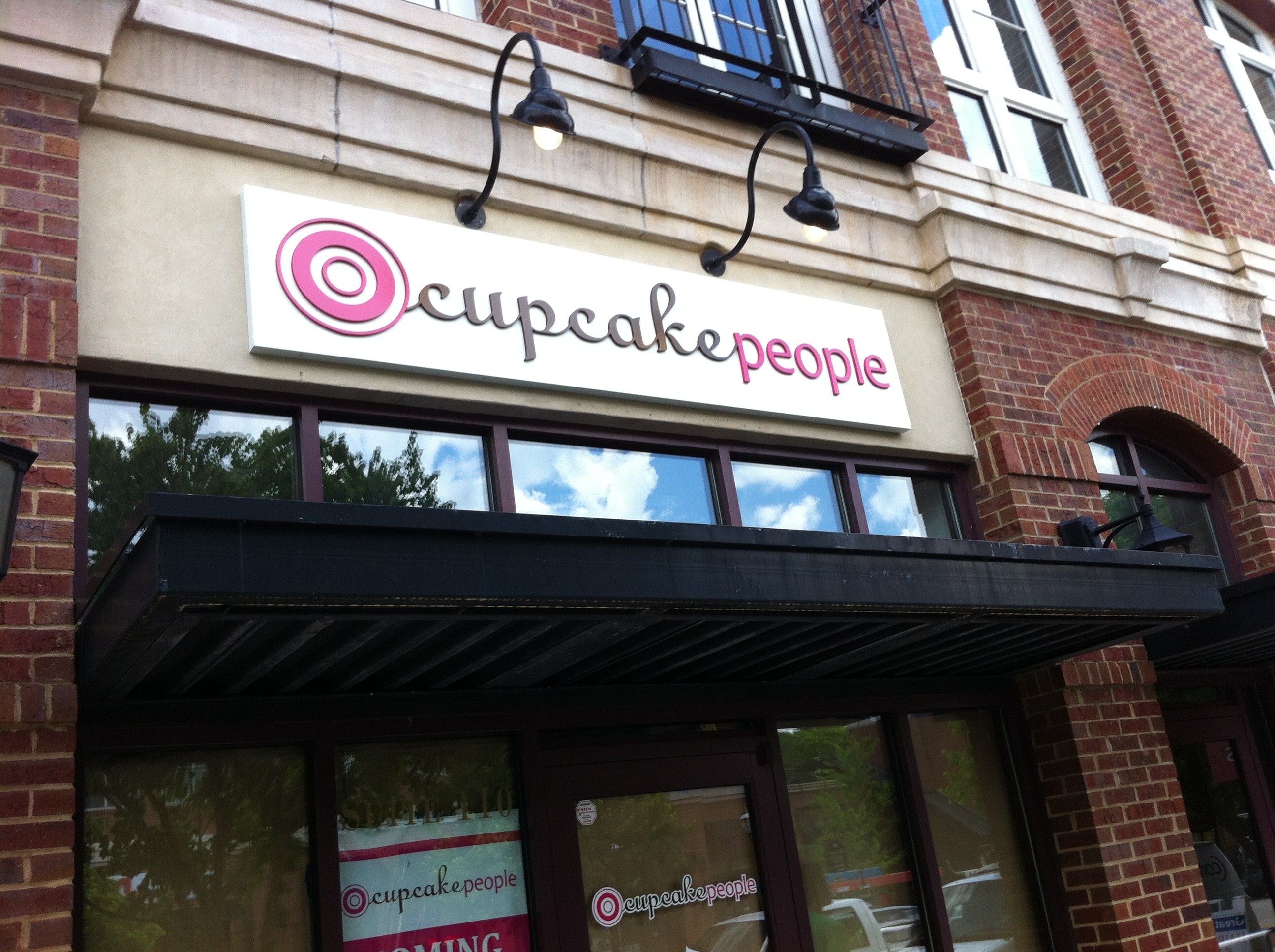
When it comes to storefront signs, both sign companies and their clients often have a tendency to over complicate things. In a quest to capture the end-user’s attention, the common strategies are, “Make it bigger”, “Make it brighter”, and “Make it more unique”. Is bigger and brighter necessarily better? Is a big, bright, unique sign the best sign for your business? “The simple things in life…” Google those five words and you’ll find a variety of websites, a large handful of quotes, and a couple of Country songs. You’ll also find some truth – – sometimes, simple is better.
“The Cupcake People” is the name of an Atlanta-area purveyor of cupcakes, aka, a “cupcakery”. Founded in 2008, The Cupcake People had started with a “red KitchenAid mixer and the love of baking…” Today, their one location has grown to three, and their menu now includes 58 flavors. (Try the “Pancakes and Bacon”. It’s ummm… “pretty good”). The first location that The Cupcake People opened was near the Sugarloaf Mills Mall in Lawrenceville, and it featured a set of front-lit channel letters for the storefront sign. However, when The Cupcake People were opening their second store location at 1245 Caroline Street in Atlanta’s Edgewood Retail District, the Master Plan for the retail development required that storefront or “tenant identification signs” may NOT be internally illuminated. External illumination – – such as by goose-neck lights – – was not only authorized, it was required. With a tight restriction on the size of the sign, “Big and Bright” wasn’t in the cards.
In order for a storefront sign to be effective, it needs to do a great job of communicating your business message. It also needs to help tell a story about the product or service that’s waiting inside the front door – – Gourmet cupcakes, made by people committed to producing the very best cupcakes you can buy. Our goal with this sign was to use the sign to tell a message beyond “Buy cupcakes here.” Instead, we wanted the sign to talk… send a quiet message as to the type of quality… reflect on the people behind the product… We felt it was important that the sign “fit” the storefront, as if it “blends in” rather than “sits on”. The entire message is conveyed in two words – – one PMS chocolate brown #476, the other PMS hot pink #214. White background with goose-neck lighting. The sign fits the architecture of the building, and the personality of the company. Mission accomplished. Simple and effective, and one of my favorite signs we’ve ever done.
Storefront signs are typically a long-term commitment to a specific medium for communicating your business message to your potential customers. Getting it right the first time is key to your business success. Getting it wrong the first time is both damaging and expensive. A great storefront sign adds value. A great storefront sign actually helps sell the product. It’s important to understand that in an environment where it seems like bigger and brighter and more complicated is the common direction, sometimes simple is the best way to go.
Written by Big Mouth Signs, Inc. – Lilburn, GA.
